Hello again!
It's been quite a while since my last post, longer than I thought. The month of April flew by as I worked tirelessly on the final illustrations for my senior show at the University of Hartford (which was a huge hit by the way!) And I officially have a BFA in Illustration with Magna cum Laude honors!
 |
| At the gallery opening with the best professors and mentors I could've asked for, from left to right: Doug Anderson, Dennis Nolan, myself, Bill Thomson |
After graduation, I took some time to get my business affairs in order. My three month, six month, one year, year and a half and two year goals are outlined and a calendar has been written. My first wave of postcards and emails have been sent out to potential clients and art reps, and I'm now officially a member of the Society of Children's Book Writers & Illustrators (SCBWI). I moved back to Long Island, and set up my new art studio in the spare bedroom. All in all, a very exciting time for me!
 |
| First batch of postcards and tear sheets! |
 |
| My new studio set up, with some decor that I picked up on my trip. |
Of course in the interim I've continued to draw, paint, and look for inspiration, which is where the meat of this week's post lies. I visited a number of museums and exhibits over the past few weeks, and I've got so much to share!
I went on a camping-trip-art-museum-excursion two weekends ago with a number of friends and fellow illustrators. We camped two nights in Pennsylvania and visited the Philadelphia Museum of Art, and the Brandywine River Museum & Wyeth estates in Chadds Ford. The third day we drove down to D.C. to visit the Smithsonian American Art museum.
Sufficed to say in those three short days I was overloaded with information and inspiration, having seen some of the greatest painters from the Renaissance through the Impressionists at the Philadelphia Museum, gawked in the presence of N.C. Wyeth, Andrew Wyeth, and Howard Pyle at the Brandywine River Museum, and sat in awe in front of the masterworks of the Hudson River painters at the Smithsonian.
 |
| Couldn't really keep it together seeing this Alma Tadema in person for the first time...I spent a good half hour with this masterpiece, and kept coming back to it whenever I wandered for too long. |
 |
| My face the entire time at the N.C. Wyeth gallery at the Brandywine River Museum. Here I am with "Crystal Depths," such an incredible painting in person... |
Of course a trip like this wouldn't be complete without doing plenty of sketching and painting along the way. We had to do
something to let out all of the energy we were absorbing from these paintings!
 |
| Did this quick sketch (10 min) of a local at a diner, "Hank's Place," right near the Brandywine River Museum. |
 |
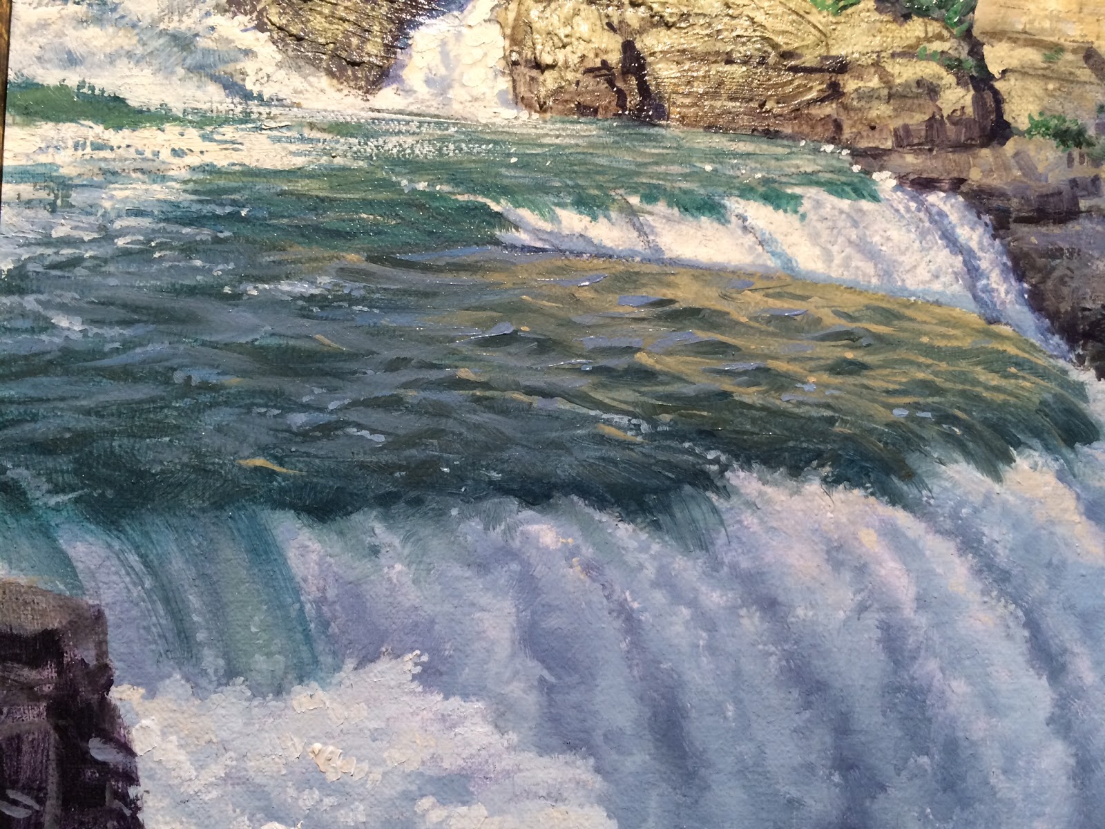
| We explored the surrounding fields and park along Brandywine Creek. I stopped to paint these very N.C. Wyeth-esque clouds in the late afternoon. 5x7" oil on canvas board. |
 |
| Painted this warm sunset peeking over the Creek from the grounds right in front of the Museum. 6x6" oil on canvas board. |
 |
| And the weekend came to an end! My friends and I sketching passersby from a Starbucks in Chinatown, Washington D.C. |
 |
| Last sketch of the trip. This was from our campground at Greenbelt State Park, MD. There was a magical glow in the woods after a rainstorm from the night before. |
I'm going to go into more detail for each of the museums over the course of few posts, making a short blog series out of the trip. There is simply too much to share in one post. But for now, I'll leave you with my major takeaways from the trip.
Even the most richly realistic paintings are abstract suggestions - illusions - of what they represent, especially when you view them up close in person. I took almost 2,000 photos over the weekend, mostly detailed views I'd otherwise not find online or in print. Details maybe an inch from the canvas at times, to the point that out of context, that inch or two looks like nothing more than a few abstract strokes of paint - nonsense, really. This was really to remind me afterwards of what painting really is - strokes of pigment suspended in a medium lying flat on a surface.
It was quite eye-opening to see masters such as Coypel, Eakins, Church, Bierdstadt or Moran up close, to see how abstract and textural their paintings really are. Alma Tadema was especially surprising! There wasn't a single painter I saw all weekend whose work was an exception to this revelation. I realized that what realism and representational art boils down to is
edge control. It doesn't matter if you hand-paint every crack and surface of stone, or strand of hair, but rather you can allow the qualities of the paint do so much of the work for you. It is really about
edge control above all else. Edges allow the eye to read a certain texture, a variety of lost and found edges can bring so much depth to a painting, strengthen the focal point and retain the viewer's interest. And
every painter, without fail and regardless of medium, allowed the qualities of the paint itself to do so much of the work.
Most incredible to me was seeing Howard Pyle & N.C. Wyeth's work in person. I was surprised to see how large the illustrations were - and they really came to life in person. They were both very, very loose in handling the paint, but less "stylized" than they appear in print. It looks largely alla prima, and perhaps the speed of painting alla prima was a necessity under the restraints of deadlines.
N.C. Wyeth was especially so rough and loose in unimportant places - just a couple of strokes indicating an entire form at times. I think working large lent itself to working this way as well, because when the paintings reduce down they tighten up. It's a similar affect to simply standing a few feet back from the painting. (I think I may try to work a bit larger on my next illustration, I'll just need to remind myself to step back often). Faces and body language were of the utmost importance in Howard Pyle's work - and as such the faces were the most carefully tended to. Other spots could literally be one stroke. One,
carefully placed stroke!
Every masterpiece I saw this weekend was in their own way loose and abstract, but
so completely controlled. It was perhaps most evident in Sargent's work in particular. In person, it almost looked like he didn't paint quickly at all, but he simply painted every stroke
accurately.
As I said, these are some rather simple major themes from the trip. Over the next week or two I'll go into more depth with some of what I experienced, and post plenty of photos!